49 Design Elements your Product Detail Page Must Have [Infographic]
Today, many people think that if they have a great product to sell, everything else will automatically take care of itself. They think that if they get a website and post a few links about their products, sales automatically will start rolling in.
This mentality could have worked 100 years ago in a small town where there was one store. And once people heard about the store they flocked there because there were no other stores.
Obviously, this is not the case today. Just on Amazon (in the US store) there are over 485 million products. Having a great product to sell is no longer enough.
When shopping online people usually open and compare a few websites. To be able to sell online you need to immediately stand out from competition and attract the attention of your prospects and customers.
Having a properly designed product detail page is a science.

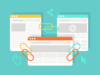
We have designed an infographic on 49 elements your product detail page must have to have a winning product detail page.
The infographic is divided into five parts: Above the fold, Below the fold, Footer, SEO and Technical requirements that you should consider.
The goal of the space on your product page that is above the fold is to get the attention of the visitors and convey that the page is for them. Visitors that think that a page is not for them are not going to scroll down. They are going to close the page.
Space below the fold is for those who are interested in your product. That’s where you should have a longer product description, product variation details, customer reviews and other features.
In addition to this, you need a proper footer, SEO friendly features, and certain technical requirements.
Here is the infographic and below the infographic is a more detailed explanation on each of the 49 elements.
Want to share this infographic on your site? Just copy the code below!

Want to share this infographic on your site? Just copy the code below!
[toc]
Above the fold
1. Customer service phone number in the header
Customer service number in the header does a few things.
First, it builds trust. Today anyone can put up a website from anywhere to start collecting money.
Having a phone number communicates to the user that there are actual live people behind the website who are there to help and that it’s not just a web page that’s there to get their money.
It’s not that they will necessary call you. It’s making your visitors feel that you are there for them and they could call you if they needed to do so.
In case your visitors need to call you, you want to make your phone number is easy to find on a page. This is why you want to have it in the header.
You may be afraid that making your phone number highly visible will significantly increase the number of calls and you won’t be able to handle them.
Research shows that this is not true. Making a phone number highly visible does not make you visitors want to switch from shopping online to shopping over the phone.
The only things that it does are building trust and providing an opportunity to talk to someone for those visitors who do need help.
2. Breadcrumb navigation
There are several reasons why you want to have breadcrumb navigation everywhere on your website, including your product detail pages.
First of all, breadcrumb navigation greatly enhances user experience for finding the way around your website.
Suppose a user wants to check a product they think they may be interested in. They visit the page, see what you have to offer and are not interested in that very product.
If you have well-structured breadcrumb navigation, the user will be able to see that this product is actually a part of a certain category. They can now easily go one level up and check similar products in that category.
This is how breadcrumbs can increase the conversion rate of your website while at the same time taking very little space on the page.
At the same time, you don’t want the breadcrumbs to be the primary way of navigation on your website. You also don’t want them to dominate your pages. Their goal is to serve as an auxiliary way to get around.
Search engines love well-structured websites that provide great user experience. This is why having breadcrumbs not only increases conversion but also scores you bonus points with Google, Yahoo and Bing.
3. Name of the product in big and bold font
Usually, people have several tabs open in their web browsers. When they are looking at your products, chances are high that they are looking at several of your products. They may also be looking at your products and your competitors’ products at the same time.
This is why attention on the Internet is very scarce and precious. One of the things you always want to do is to have your pages almost scream what they are about and who they are for.
This is why you want to have your product name in a big and bold font. Your visitors need to be able to tell in a split of a second what the page is about.
The truth to remember here is that a confused person on the Internet usually doesn’t spend time trying to figure things out on a web page. He or she simply leaves.
Make sure that your product names really stand out on your product description pages.
4. Reviews of the product using 5-star format
Today, having a great product to sell is no longer enough to have great sales. The Internet provides all of us with endless choices for services and products in all categories.
This is why in addition to having an awesome product you also need to sell it well.
One of the best ways to do so is to have a lot of reviews using the 5-star format. Product pages with reviews convert 58% more and increase revenue by 62% more.
Having a lot of positive reviews is similar to having a lot of friends telling you about a great restaurant, service or product.
On the Internet, information spreads out instantly. This is why we all think that if something is good, then there are other people who think that it’s good.
Your reviews in a 5-star format are a way of proving that about your products.
This is the format everyone is used to on the Internet. Multiple companies use this format, from Amazon to Uber to TripAdvisor, which makes it a de-facto Internet standard for reviews.
5. Schema.org integration for the 5-star review
Schema.org is a set of ways to structure data on web pages.
Schema.org has an aggregate rating schema generator that will create a number that has an average score based on multiple reviews.
Here’s why using schema for the 5-star review system on your product pages is important: it will help Google and other search engines determine that this is a page where something is being reviewed or sold.
As you may know, Google has a service called Google Shopping, previously known as Froogle, Google Products, and Google Product Search.
This service is not as popular as Amazon, which today is basically a search engine for shoppers. However, Google Shopping is integrated with Google search and having a Google-optimized product detail page will help you rank better on search engines.
6. Multiple product pictures
As you can see, we recommend having one primary picture and a number of secondary pictures for every product.
Will having a lot of pictures help you sell more items? It may or it may not, but having pictures definitely won’t hurt your sales.
Here’s what prospects do on a product web page: they look for information that’s important and relevant to them.
If they find the information they are looking for and they are satisfied, they will stop looking further and click the buy button.
If they don’t find the information they are looking for, they will probably leave and look for a product that does have the information they are looking for in its description.
This is why you want to do the best job possible describing your product and showing how it looks. Adding an extra line in a description or adding a few extra pictures won’t cost you much, yet it can be the difference that will turn a prospect into a buyer.
Put some effort into creating a lot of great pictures of your products. This is a worthy investment that will pay off.
7. Video of the product
Having a lot of pictures in great, yet sometimes pictures simply can’t capture your product from all the angles or show all of its advantages.
Often times color also gets distorted in pictures and is better portrayed with videos.
This is why in addition to pictures you also want to have a video clip showing your product.
It is undeniable that today video has a much broader appeal than still photos. Ice.com increased conversion by 144% after adding videos on product pages
Another thing to remember is that the younger your customers are, the likely they are to consume more video content than older generations.
The same thing is true about videos as about photos: it doesn’t cost you much to do it. You should a video once and it will be on the page forever offering your prospects to take a look at your products from all the different angles and decide if they want to buy.
8. Show regular price of the product
When shopping, we all love to get a bargain. This is why it is great if you can show a regular price of a product, cross it out and show your price, which is lower than the regular price.
The price that you cross out may be suggested retail price also known as MSRP. MSRP is usually the price that a manufacturer recommends to use for selling a product at a retail or online outlet.
However, you need to very careful with the prices that you cross out. Recently, Macy’s, Bloomingdale’s, Kohl’s and Kate Spade have been hit with a lawsuit accusing them of artificially inflating regular prices they showcase on discounted or outlet merchandise.
According to the lawsuit, the retailers frequently use deceptive strategies and misleading product labels at their stores. In particular, tags for merchandise sold at retail locations did not reflect the previous price of the products or comparable market price.
This is why while it’s great if you can put a higher number here, putting something artificially inflated is not a good idea.
9. Sale price of the product
Sale price can be different from a regular price or Manufacturer’s Suggested Retail Price or MSRP. See a note in #8 about the difference.
Pricing your merchandise correctly can significantly improve how much you sell, creating grounds for your business to prosper. At the same time, if you choose a wrong pricing strategy, your business may get stuck and experience problems that you won’t be able to overcome.
There are hundreds of different formulas and types of pricing strategies. However, there’s no one magic pill, no strategy that works for everyone in every scenario.
Pricing your product properly usually involves analyzing key factors such as the prices of your competitors, your target market, features and quality of your products.
One of the best ways to see if you are priced too low is to have a premium version of the product that sells at a 20% to 40% higher price. If you have the majority of customers buying the premium option, it means that you are most likely underpriced. Raise the prices, create two options again and see what happens. You know that you are priced right when your premium option accounts for 20% to 30% of sales.
10. Invoke product scarcity
Scarcity is the state of being in short supply. In economic theory and practical selling, scarcity is mostly about supply and demand. Basically, the less there is of something, the more people want it and the more valuable it is.
Apple is one of the companies that do a phenomenal job at implying scarcity. You have probably seen stories about people waiting overnight to get the latest iPhone. This would not be happening if Apple were to say that anybody who wants a new model phone could have it on the first day it is released and that there are enough phones for everyone.
This is why is it worthwhile to invoke scarcity and emphasize the potential for wasted opportunity to get your product.
As Robert Cialdini, the author of the book Influence, says, the tendency to be more sensitive to possible losses than to possible gains is one of the best-supported findings in social science.”
Examples of scarcity language may include:
Don’t miss the chance to…
Here’s what you’ll miss out on…
Only X left in stock…
And so on
11. Free shipping
Alfred Taubman was one of the most successful shopping mall developers in the US history. He used the term threshold resistance to describe the circumstances that needed to be in place in order for people to come to a store and make a buying decision.
One of the biggest hurdles you have when selling on the Internet is people abandoning a shopping cart at the very last step, right before entering their credit card number and clicking the buy button.
There are several reasons for it. Someone may get legitimately busy with something else other than finishing an order.
Another problem may be that a visitor may be unpleasantly surprised by shipping costs and taxes added at the last step and that would prevent a user from finishing an order.
Today more and more internet retailers offer free shipping, either with any purchase or with purchases above a certain amount. This is why more and more buyers are used to free shipping when shopping online.
This is why if you want to compete on the Internet having free shipping is the best thing you can do to compete effectively and avoid last-minute shopping cart threshold resistance. Or just make sure to mention your shipping policy on the product page itself so that users are not surprised.
12. Show product variations
There are several steps a person needs to take to make a buying decision. The first step is deciding whether a product is for them. The second step is finding a variation of the product that he or she likes. This usually includes color and size.
A person may like the model of shoes, but if you don’t have them in the right color or the right size, they are not going to buy.
This is why you want to have multiple product variations for your products and you want to show the variations right away so that a user looking for a model in a certain color and size could immediately see if this variation is available.
You want to avoid a scenario when your visitors have to call or email you to ask you whether you have the options that they want in stock.
Usually, the more steps you have in a buying process, the more people you will lose at each step.
Make the process of buying from you simple and convenient: show all the product options and variations on the product description page so that the user could make a purchase without having to contact anyone or looking for answers about your products on other pages of your website.
13. Schema.org integration for the price
We have discussed what schema integration is when we talked about 5-star reviews in the item #5.
Using schema.org for pricing is very similar to that.
Schema.org has a price feature that you can use for price offer or a price component when attached to other schema parameters.
You can use priceCurrency property of schema.org to format numbers as prices instead of using symbols such as $ in the value to show that a number shows the price.
Just like with schema.org integration for reviews, the integration for pricing shows Google and other search engines that your page has products for sale, which increases the chances of your appearing in Google Product Search when someone is looking on Google for what you have to sell.
14. Call to action button (Add to Cart or Buy Now button)
The absence of the call to action on a web page is one of the most common mistakes Internet sellers make. They get so busy and excited with describing their products that they forget what the goal of the product description page is.
The goal of a product description page is to sell products. You only have descriptions because you want to sell. Making a sale is the main goal. Everything else should be helping you achieve this goal.
It is important to remember that people today have very short attention spans. Also, it is very likely that they are looking at several internet pages at a time.
Hoping that someone will read about your product and then will make an effort to buy it is not very realistic. You want your buying process to be as simple as possible.
This is why you want to have a big and bright “Buy Now” button. You want your visitors to be able to see that it’s a page that sells products and that after they read the description they’ll be able to click on the buy button and buy without trying to figure out where and what they need to click to give you money.
15. Most important features of the product that matter to the buyer
Different customers and buyers have different priorities. Some care about the color of a product. Some care about weight. To some, it’s about your product being better than what your competition has to offer. Others may be looking for a feature that may not seem important to you, but is important to them.
Thankfully, a web page is not made of paper. You are not paying for ink or space on your page. You can create it the way you want it to be. This is why the smart way to go is to list the most important features of the product that matter to the buyer in the list format.
How do you know what matters to the buyers? Simple! Ask them or look at your reviews and testimonials to see what your customers may like most about your product. Notice that what they like most is not necessarily the same thing that you like most. How do you know which features to put first on the list? See what features your customers mention most when they describe your product and their experience using it.
16. Add to wish list option
While a lot of visitors who come to your product pages are ready to buy there and now, some people are just looking for things they may like and may want to purchase later.
Having an “add to wishlist” option lets your visitors save for the future the items that they want to purchase. It may be that today they don’t have sufficient funds to buy. It may be that they know that they will need your item at a certain date in the future and they do not want to get it in advance for storage or usage reasons.
In any case, you want to make buying in the future from you as easy as possible.
Just like a lot of people have a “To Do List,” a lot of people have a “To Buy” list on their computers, notepads or in their heads.
Some people simply do not like to make purchases in the moment and want to keep things in perspective using WishLists to avoid impulsive buying.
If someone is not an impulsive buyer, you won’t turn them into one with your product description page. This is why it is simply best to give them the option to buy the way they like to buy by having an add to wishlist feature.
17. Integrate social share buttons
When thinking about social buttons a lot of people are thinking about them one-dimensionally and are measuring their effectiveness purely by the number of shares that the buttons bring.
Having social media buttons on your product description pages helps you accomplish a few things.
First, it builds trust. When people see the buttons they imply that you are open to sharing information about your products with others. This has a similar effect as having your phone number in the header of your website does. It communicates that message that you are running a legitimate business and are interested in interacting with your users.
Second, your buyers may actually share links to your products on their social media profiles. This especially applies if you have the kinds of products that people like to brag about. It may be new furniture, new clothes or shoes that someone wants to show to their friends.
Third, it is about SEO. Search engines see your website as more trustworthy when you have social buttons.
Below the fold
18. Product detail section
Product detail is the first section below the fold. Usually, your visitors are looking at the page above the fold to get basic information about your products and determine if they are interested or not.
If someone is not interested in what you have to sell, they are not going to scroll down on your page. They are simply going to leave.
This is why you should treat below the fold areas of your page as areas for those who are really interested in what you have.
The rule of thumb is simple: you behave yourself differently when you know that someone is interested in what you have. This is why here, below the fold, you description can be much longer. You want to be short to get attention and have long versions for people that want to know more.
You can also give technical details and specifications because now you are dealing with people that expressed their interest by scrolling down and looking for more information about what you have.
19. Product SKU/Code
SKU is short for Stock Keeping Unit. SKUs are also known as model numbers, product codes, unique product identifying numbers, part numbers and so on. An SKU is often a scannable bar code that you can see on a product or on the packaging.
If you have just a few products that you sell, you may not have or need SKU, but if you have a lot of products, you want to have a way of uniquely identifying them.
An SKU can often work as shorthand for longer descriptions. Instead of entering a long number or name when looking for an item in the system, you can use a shorter number that’s still unique. This can significantly speed up the process of inventory tracking and data entry.
Here are some tips how to create good SKUs.
First, never start an item number with a zero. Some systems don’t recognize numbers that start with zeros. Other systems may remove the zero and you’ll up will a mess.
Secondly, avoid letters L, O and I. These letters can be confused with numbers, which may also cause problems
Third, keep your SKUs long enough to be unique, but short enough to be convenient to use. Four to eight symbol long SKUs should work just fine for most businesses.
20. Clean and easy to read font
The number of people accessing the Internet from the mobile devices outgrew the number of desktop-only users in early 2014. Today most people access the Internet both from mobile devices and desktops.
A few years ago when putting up a website all you needed is to check how it looks in a few different web browsers and that was it. A few platforms, a few default screen resolutions and you were done. If the website looked good, your website was good to go.
Today the number of browsers, operating systems, various devices, screen sizes and default fonts is much bigger than even a year or two ago. Almost every electronics manufacturer has a tablet or a smartphone as a part of its product lineup.
Because of this, you can’t predict what device a visitor to your website is going to be using. At the same time, you want to make sure that your pages look great no matter what device they are on.
This is why you want to use clean and easy to read fonts. The goal for your website is to be easy to read on any and every device out there.
21. Product dimension if it matters to the user
Depending on your product, its dimensions can be very important to the users.
If you are selling furniture or similar items, your prospective buyers may care about every inch in the dimensions, because they need to know if the furniture is going to fit into their existing setup or room, be it kitchen, living room or bedroom. The same applies to products such as grills, kitchenware, TVs and many others.
It also may be that your product is much bigger than what your customers think. In this case, you also want to let your customers know about its dimensions.
The rule here is very simple: if dimensions matter or if your customers have any misconceptions about them originally, mention it.
It’s better to put everything upfront and explain why your product being bigger or smaller is actually a good thing than to deal with unhappy or angry customers because the product they received was not what they expected.
22. Product weight if it matters to the user
Similarly to dimensions weight can play a factor for the buyers of your products. If the weight doesn’t really matter you can simply mention it and that’s it.
If you product if significantly heavier or lighter than the competition, you may explain why it is so.
If it is heavy, you can say that it’s made of very durable materials and will last for a long time.
If it’s light, you can point out how easy to use and convenient it is.
The principle here is simple: work with what you have and turn features into the benefits. Every feature can be positive or negative. It’s all the matter of perspectives.
23. Product origin
Today we live in a global world. Our TVs are made in Korea. Clothing is made in Bangladesh and Vietnam. Almost anything and everything can and is made in China.
We are used to this. Most people don’t really care where the products are coming from as long as they are of great quality. If you have great reviews, most likely people are not even going to look at product origin.
However, if the country of origin can play a role, you want to underline it.
Is your product made in the USA? If so, you can talk about how what you do is patriotic and supports the American economy.
Do you sell coffee makers that are made in Italy? You can describe how Italians love their coffee and how your Italian coffee maker is better than anything else on the market because of this.
Is your product unique because it is being made is some exotic country? Make sure to mention in on your product page!
24. Comparison table with other models or product variations
Your product description web page will attract different kinds of buyers.
Some people know exactly what they are looking for and if the price is right and you have the options that they are looking for, they will buy.
Other people may care about the story behind your product and will pay particular attention to the description, but aren’t going to look at the numbers.
Analytical buyers don’t really care about the story but want to know everything about the features and numbers. How long does the battery last? What are the dimensions? What makes your product different from similar products in the lineup?
Since on the Internet you are not paying for page space, you can and should include information in different formats for different kinds of buyers.
People who care about the story of your product will simply not look at the numbers.
People who care about the numbers will skip non-numerical description and go to comparing the features.
In either case, you provide visitors with the information that they are looking for which means increased probability of making a sale.
25. Detailed customer reviews
Having detailed customer reviews is important for a number of reasons.
First, your customers can say things about you that you can’t say about yourself. If you were to say that your product is the best there is, your prospects would think that you are building hype in order to sell what you have. If others are saying that your product is the best in its category, that’s not hype but a true statement because it’s not coming from you.
Secondly, having a number of different reviews from different people builds trust. Every person has a unique perspective and a unique way of looking at things, which reflects in how people write. Having a lot of reviews means that there are a lot of people using your product and sharing their thoughts about you, which again is a boost to your credibility.
26. Review form to allow buyers to leave a review
A review form that allows buyers to leave a review is the easiest way to collect feedback from your buyers.
When seeing a review form on your product detail pages your buyers will know that they can simply type a review without having to look for your email or doing some other work trying to figure out how they can get in touch with you and let you know what they think.
A review form also helps build trust. Even when a customer doesn’t leave a review, they see the review form, which by itself communicates that you welcome feedback from your customers.
27. Trust badges to invoke trust
When discussing detailed customer reviews in #25 we mentioned that customers can say things about you that you can’t really say about yourself and that it build trust.
Trust badges work in a similar way.
There are a lot of companies and organizations that offer all kinds of third-party certifications, from the manufacturing process and testing of the ingredients to making sure that your website and shopping cart are virus- and malware- free, tested and secure.
Such certifications help you obtain increased credibility and acceptance, benefit from increased product and experience quality and safety and demonstrate compliance with standards and regulations of your industry.
If you have won any awards, are certified, if your product has won any challenges, you want to list the awards here. Check with the organization that has tested your product to see if they have any logos and badges that you could use.
There is no such thing as having too many awards, so you everything and anything that you have.
28. Call to action button again below the fold
We have discussed the importance of the call to action button above the fold in the item #14.
The purpose of that call to action button was to make it clear to your website visitors that the page offers an item for sale and make it easy to buy.
However, not everyone is ready to buy right away. Visitors who scroll down the page are interested in your product and below the fold you are talking to those who have shown that they want to know more about your item by scrolling down the page.
The goal of your product description page is to sell your product. You want to make buying your product easy.
That’s exactly what having multiple calls to action buttons does. By having multiple buttons you are making it convenient to buy. Your visitors don’t have to scroll up and down the page looking for a button that they saw at some point before, they can simply click on another button that adds the item to cart.
29. Section for FAQ
Most likely you have prospects asking a number of questions about your product. What material is it made of? How durable is it? How long does the battery last? And so on.
Instead of answering these questions individually every single time when someone sends you a question you should organize them into FAQ section of your website.
In the FAQ section, you can use the information from the product description and comparison tables. For example, you may have mentioned how long the battery lasts in the product description and comparison sections. Here you can do that again.
The reason for it is very simple: different people look for information in different places. Some will be looking in product details, some will look at the comparison table and some will read the FAQ.
Basically, this is the place to answer basic questions in question-answer format and answer the questions about your product that you didn’t cover elsewhere.
30. Allow customers to ask questions about the product which you can then answer
Similarly to having reviews and an opportunity to write a review you want to have an FAQ section and an opportunity to ask a question.
Whenever someone asks a question, no matter how rare or random the question is, add it to the FAQ. It doesn’t cost you anything, yet if anyone in the future has the same question, they’d be able to find it.
The reasons to allow customers to ask questions are the same as with reviews.
First, it builds trust. It means that you are being open and welcome questions.
Second, it makes the life of your visitors easier. They do not have to guess about what they should do if they have a question. They can simply use the window to ask one or several.
It may happen that you will see prospects ask the question that you have already answered in the product description section or in the comparison table. If this happens, it means that for some reason your prospects are not reaching that part of the description.
Move it higher in the section or highlight it to make it more visible and see if the questions stop.
31. Show other related products
A lot of business people erroneously assume that once a customer buys something they are not buying anything else. The logic here is simple: the customer has just spent money. They are not spending more.
In reality, the opposite is true. When people are buying something, they get into a buying emotional state. This is why the easiest sale is a sale immediately after someone has just bought something.
What can you sell right after a sale? There are two options: upselling to a better bigger more expensive version of a product or selling something complimentary, like an accessory or an extended warranty for a product that you’ve just sold.
This is what smart Internet retailers like Amazon are doing all the time. Almost every page on Amazon has a “frequently bought together section.”
The other reason to have related product links is to give people a choice to buy something else. In case they decide that they are not interested in the product they were just looking at, you want to show them other products that may peak their interest.
32. Show return policy
Most people think that buying on the Internet is more dangerous and risky compared to buying from a retail store. One of the main risks has to do with returns. 63% of American customers check online return policy before making a purchase.
Everyone is used to the fact that they can go back to a retail store, bring a product with a receipt and get their money back.
However, this is not always the case on the Internet. There are a lot of companies with terrible customer service and return policies. Some businesses do not accept returns while others make it as hard as possible for their customers to return purchased items.
This is why prospects in doubt always check your return policy.
The best thing you can do is have a generous return policy where you pay for shipping of the items. This will show to your prospects and customers that you are really serious about providing exceptional service and are confident about the quality of your products.
33. Show any guarantees or warranties
In addition to information about your return policy, your customers want to know about the guarantee that you provide with your products.
Many businesses are afraid of giving big bold guarantees thinking that dishonest customers will take advantage of such guarantees. In reality, this almost never happens. If someone wants to take advantage of you, they will find a way.
They may try and return a used product, claim that they never received what you sent them, complain about the quality of an item and so on. Scammers will always find a way.
At the same time, a generous guarantee will show to honest prospects that you are confident about the quality of your product. This may help you make quite a few sales.
This is why having a generous guarantee and talking about it is a great strategy that can help you increase your sales.
Footer
34. Customer service options in the footer
44 percent of online shoppers report that being able to ask questions and get answers during the purchase process is important to the shopping experience. We are now discussing the footer, which is at the very bottom of the page.
You want to make the experience of your website visitors as pleasant and friendly as possible. This means having all the information on the page that someone may be looking for. That’s what this infographic is fundamentally about for product description pages.
You also want to make sure that your visitors don’t have to scroll unnecessarily. This is why you want to have customer service options in the footer. This information is important, which is why it needs to be present on a page twice.
Most people today are used to a basic menu in the header of a website and all options also replicated in the footer. This is the last thing that you have on the page, so you can take the space to provide all the links to all the pages and places that contain important relevant information.
35. Links to return policy, refund policy, and shipping policy
Also in the footer, you want to have links to return policy, refund policy, and shipping policy.
The reason for having them in the footer is simple: most website users are used to the fact that footer has an extensive menu with all the important links.
They may be too inattentive or lazy to read the entire page or search it for the information. What a lot of people do is scroll down and look for links.
It doesn’t cost you anything to place the links in the footer, so do it for convenience and improved user experience.
36. Links to main product category pages
You want to have links to main category pages for two reasons.
First, they improve the SEO of your website.
Second, they may be of interest to people who want to learn more about other products that you have on your website.
Someone may spend time on a product page and decide that while it is interesting, it is not what they are looking for. They may want a product of different size or with other functions.
A link to main category pages would allow such a user to easily see the entire category and find something that they are interested in.
37. Links to company social media pages
Many Internet marketers are convinced that links to social media accounts have a significant impact on your rankings with the search engines. A few active social media accounts can make the experience of learning about your company fun, personal and engaging.
Someone who is not yet ready to buy from you may scroll all the way down, click on a link to your social media account and learn about your company in a way that’s very different from what you can say on your website.
Social media channels show no signs of becoming any less important anytime soon both for link-building and brand-building purposes.
This is why it is smart to continue to build your social media pages and have them integrated with your website.
38. Newsletter sign up feature
You will have different kinds of visitors spending time on your product description pages.
Some people will be looking to buy there and now. Some will be just doing research and will be looking at the products thinking about buying in the future. For those people, you have an “add to wishlist” feature.
Others are not even sure if they want to buy. The best way to get such visitors as customers is to build a relationship with them. To tell them more about your company, to educate why your products are better and what makes you different.
The best way to accomplish these goals is to regularly send out a newsletter about your company, new products, and related subjects.
Nowadays people are very busy, so chances of someone consuming a lot of information at once are really small.
With a newsletter, you are allowing people to consume small bits of information one at a time, which is more realistic than having to deal with information overload.
In addition to this, the fact that you are sending newsletters on a regular basis builds trust and elevates you as an expert. The perception is that newbies and con artists do not publish free regular newsletters full of content and useful information. Only real experts do that.
SEO
39. Optimize meta title
Meta Title Tag is one of HTML elements used to provide information about a website page to users and search engines. Search engines use meta title tags on their pages to display the title of a page.
The title element is supposed to accurately and concisely describe the content of a page. It is critical to both search engine optimization and user experience because this usually is the first thing a user sees about a page. The title element creates value in three areas: browsing, relevancy and search engine result pages.
Think about title tags as if there were titles in a book. Their goal is to tell what a page is about. Title tags also help people decide whether a page they are about to visit is for them.
A title tag should be no more than 70 characters long including spaces. Google usually displays 50 to 60 first characters of a title tag. You can expect at least 95% of your title tags to show properly on Google if you create meta titles that are under 55 characters.
According to search engine experts, the closer the keywords in the title tag are to the beginning of the tag, the more helpful they are for the ranking of that keyword.
40. Optimize meta description
Meta Description Tag is another very important HTML element in addition to the Meta Title Tag used to provide information about a website page to users and search engines.
The goal of meta description tag is to summarize a content of a page. If the title tag is similar to a title of a chapter in a book, meta description tag is similar to a chapter’s summary.
Meta description tags appear in search results right next to the title tags. There is no right number for the length of a meta description tag. Google and other search engines decide in each individual case how many characters they want to show.
As a rule of thumb, your meta description tags should be between 135 to 160 characters.
Your description tags should be actionable, written in active voice and include a call to action. Fundamentally your description tags work as your sales copy where the product you are selling is your web page.
Your meta descriptions should be unique. Google thinks that if your meta description is a duplicate of some other web page, then user experience will suffer.
You want your main keywords present both in meta description and meta title of a page. In this case, Google will be more likely to bold the keywords both in the title and the description. This will make your page stand out in the search results.
41. Name of the product as H1 tag
H1 tag in HTML is the header tag. It is usually the title of a post or other text that you want to emphasize on a page.
While H1 tag and the title tag serve the same purpose, there is a difference between them
The title tag is what shows up in search engines. It is the link in blue in Google’s search results that users click on. It also shows in the title bar of a browser on the very top of a page and it is the default name used by browsers when you bookmark a page. At the same time, a title tag doesn’t show anywhere on the actual web page.
What shows on the page is the H1 tag. It is a text in a large font that serves as a title for the page on an actual page. As a rule, H1 tags usually do not appear in the search engines.
On your product description pages, you want to make your product names to be H1 tags.
Both title tags and H1 tags are extremely important for search engine optimization because they help Google understand what your website and your web pages are about.
H1 tags also help understand Google what is most important on a page.
42. Alt tags for each product picture
Every image that you have on your web page has an alt attribute. This attribute provides alternative information for an image in a case when a user can’t see the image. This may happen because of a slow Internet connection, an error in the link to an image or user’s screen settings.
Search engines can’t read information on the images. They can only read text descriptions. This is why alt tags should describe what you have on an image and what purpose the image serves. This strengthens your message to search engines about the contents of your pages and helps your pages rank better in search results. Google uses alt tags to not only determine what your images are about. Google also thinks that alt text is a good indicator of what the text around the image is telling to the user.
For example, if you have a buy button to buy a product A as an image, the best alt text for this image is “button to buy product A.” This will tell Google what is going on and also visually impaired will know what the image is about.
For your product pictures, you want to have a description such as “A photo of the left side of the product A.” Similarly to the buy button description this will happen both search engines and users avoid any misunderstandings in case your images don’t show on a page.
43. Make sure duplicate product pages are not created
Duplicate pages are pages that appear on your website more than once. The problem with duplicate content is that it’s hard for search engines to determine which page is more relevant to the searches performed by search engine users.
Because of this, search engines are having the following problems:
- They don’t know which version of a page to show
- They don’t know whether they should apply their metrics to pages as one or keep them separate
- They don’t know which version of a page to store in their database
Because of all these issues your rankings will suffer if you have duplicate content.
In most cases the best way to deal with duplicate pages is to set up a 301 redirect from duplicate pages to the original page. A 301 redirect is a permanent redirect message. It tells the search engines that the page has moved to a new location. 301 redirects usually pass on 90% to 99% of “link juice” to the new page. Fundamentally, a 301 redirect tells search engines that a page was a duplicate and provides a link to the original page, which solves all the issues described above.
When multiple pages with duplicate content point to one original page, they stop competing with each other and create stronger popularity and relevancy for the original page.
44. Integrate Google Analytics
Google Analytics is a freemium web analytics service offered by Google. Google Analytics can track and report everything about your website from the number of visitors to countries where the visitors are coming from to length of stay on the website to the popularity of different pages.
Today Google Analytics is the most popular web analytics service in the world.
Google Analytics can be integrated with AdWords, Google’s advertising platform. When using both platforms together, you can see not only the data for your website but also the relevant data from your marketing campaigns. You can set, monitor and track goals such as sales, lead generation, downloads of files or views of specific pages.
For the casual user, Google Analytics shows dashboards with high-level data. In-depth data is sent to the reports.
Google Analytics can help you identify pages that are not performing well, show you where the visitors are coming from and let you employ advanced features such as custom visitor segmentation.
Nowadays Google Analytics also offers mobile performance reports that show how your website is doing on mobile devices, content efficiency reports that explain what pages are engaging your audience the most, landing pages reports and many other reports and features.
45. Integrate Google Search Console
Google Search Console, previously known as Google Webmaster Tools, is a free service by Google to webmasters.
Fundamentally, Google Search Console shows you your website through Google’s eyes.
It allows webmasters to check website’s indexing status with Google and optimize websites for Google.
To add websites to its database Google uses robots called crawlers. Google search console allows you to check and set the crawl rate and view data about when Google crawlers accessed your website.
It also shows internal and external pages that contain links to your website. This can help you identify which of your link-building activities are working and which are not.
In Google Search Console you can obtain a list of pages that Google crawler had difficulties with. You can also see the keywords that led to your website being shown in Google’s search results, including click through rates of such listings.
In addition to that, theirs is a number of other features such as notifications for manual penalties, demotions of site links and others.
46. Search Engine friendly URL structure
Google and other search engines focus first and foremost on user experience. They will rank your website well if you have all the proper descriptions, tags, and a clear URL structure.
Google thinks that everything about your website and its pages should be clear and simple to your users. There should be a page name in the title tag, description of the page in the description tag and a headline in H1 tag.
Similarly to this, Google likes it when your URLs follow the same pattern of being created with your visitors in mind.
What’s an SEO friendly URL? It’s a URL that looks like website.com/topicname versus a seo-unfriendly URL that could be, for example, website.com/p23334ssse4
This means that your URL names should have meaningful keywords and subject names in them, not gibberish combinations of numbers and letters.
This is why you want to avoid dynamic and relative URLs. These are the URLs that are created automatically by your content management platform. With dynamic URLs, it’s often impossible to figure out what a page is about. A static URL with keywords is very user-friendly and straightforward.
If you do have pages that use dynamic URLs and you absolutely need to keep them, you can hide them from search engines by preventing Google to crawl them via your robots.txt file.
47. Mobile Responsive
The number of mobile users has surpassed the number of users who access the Internet from their desktop computers in early 2014.
According to Statista.com, worldwide mobile internet user penetration in 2015 was 52.7%, meaning that 52.7% of all smartphone users had internet access. This number is projected to grow to 63.4% by 2017.
Most users today use a combination of various devices, including smartphones and desktop computers, to access the Internet.
These numbers and facts mean that having a mobile-friendly website is no longer optional, it’s a must. Google started punishing non-mobile-friendly websites with penalties in April of 2015.
Truth is, if your website is not mobile-friendly, you simply won’t be able to rank high on Google today.
One of the best ways to check if your website is mobile-friendly is to use Google’s own mobile-friendly test.
Google’s help page for the test explains exactly what Google is looking for in websites.
One of the best ways to have a mobile-friendly website is by having responsive web-design. Responsive web design serves the same HTML code on the same web address regardless of the device a visitor is using to access your website. At the same time, such design can render the display differently based on the screen size of each specific device.
48. Optimize loading speed of the page
One of the things Google wants from a website is fast speed. Search engines regularly check the loading speed of the websites that they have in their databases and demote websites with low speed.
The logic here is very simple: slow loading speeds worsens user experience. This makes perfect sense because nobody today is willing to wait for more than a few seconds for a website to load.
It seems that on the Internet we all get very impatient and frustrated very quickly when things don’t work our way.
The first think you want to do is to check the speed of your hosting provider. You may have a great website, but if you hosted with a cheap unreliable hosting provider than speed issues are inevitable.
By using Gzip, a software application for file compression, you can reduce the size of your script files such as CSS, HTML, and JavaScript very significantly.
To increase your website loading speed you should also reduce the number of redirects. Every time a page redirects to a different page your visitors have to wait a little bit more.
Finally, make sure that your images are not larger than they need to be, that they are in the right file format and you are using CSS sprites for images that you use frequently.
49. Cross browser compatible
Cross browser functionality is one of the features of responsive web design.
During the creation of a website one of the most frequent problems that web designers face is compatibility of the website with different Internet browsing software.
The designer of a website must check that the website works properly and that it appears without errors and functional problems on any platform that can be used to view the website.
Because of the number of platforms and devices today, this is one of the most complex and frustrating aspects of new website projects.
However, it is essential that this part is taken care of and completed. Otherwise, your bounce rate will go up, your ratings with Google will suffer and you will face a number of other problems and issues.
One of the biggest issues with cross browser compatibility is image management. Photos, videos, and other media need to be flexible and adapt to different mobile and desktop devices, but at the same time, it is vitally important that they don’t slow down the process of loading a page.
Conclusion
In our infographic, we have shared everything you need to know about creating a product detail page that sells.
You have learned about the 17 elements you need to have on your product pages above the fold. We explained why you need a phone number, how to format and show product reviews, fonts to use, discussed the importance of the call to action button and covered the subject of pictures and videos.
The second part of our infographic discussed the features that you need to have below the fold. That’s where you can describe your product in more detail, share reviews, answer questions and have forms to leave a review and ask a question.
Next, we have discussed the importance of having a footer and everything you need to have in a footer of your website.
Then we have covered everything you need to know about making your product pages Search Engine Friendly, from optimizing your tags to integrating Google Analytics and Google Search Console.
The final part of our infographic had to deal with technical requirements for your product pages. You’ve learned why having a mobile responsive website is so important and how to make sure that your website loads quickly for optimal user experience.
Use these elements on your product pages and start selling more products today!